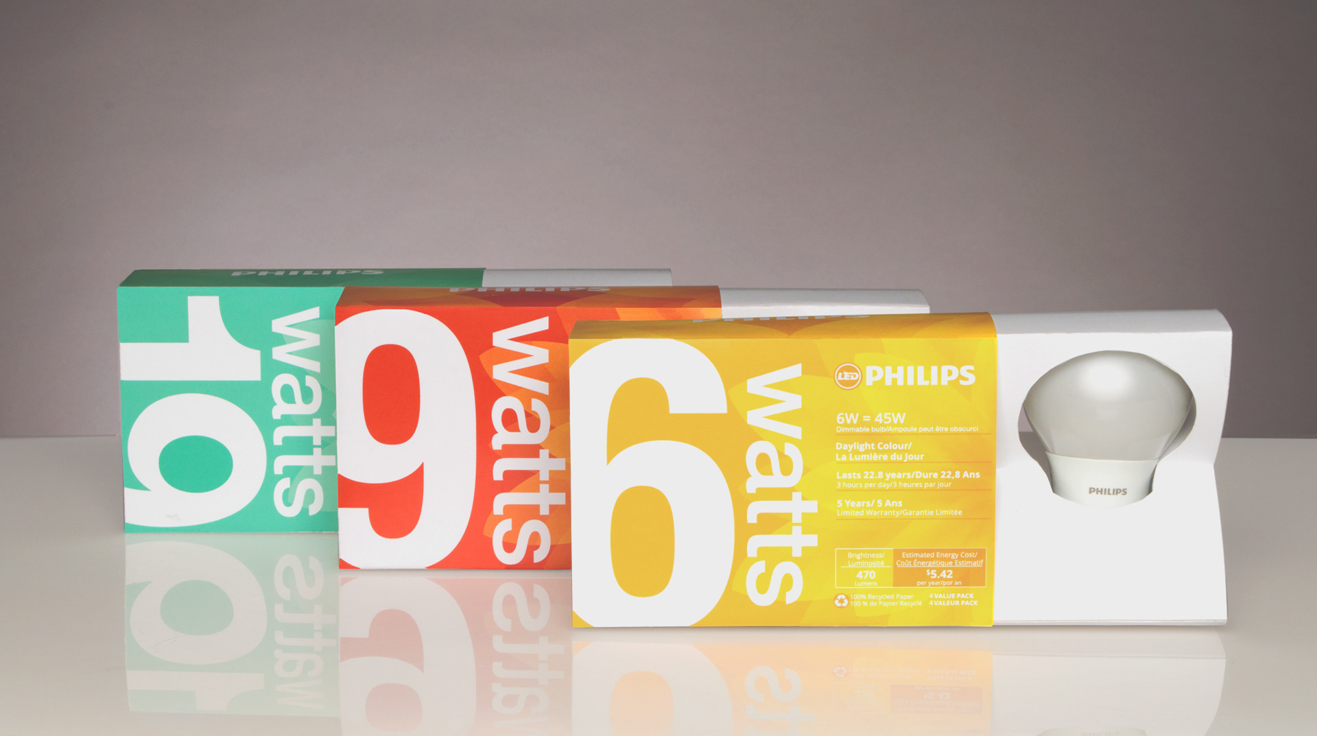
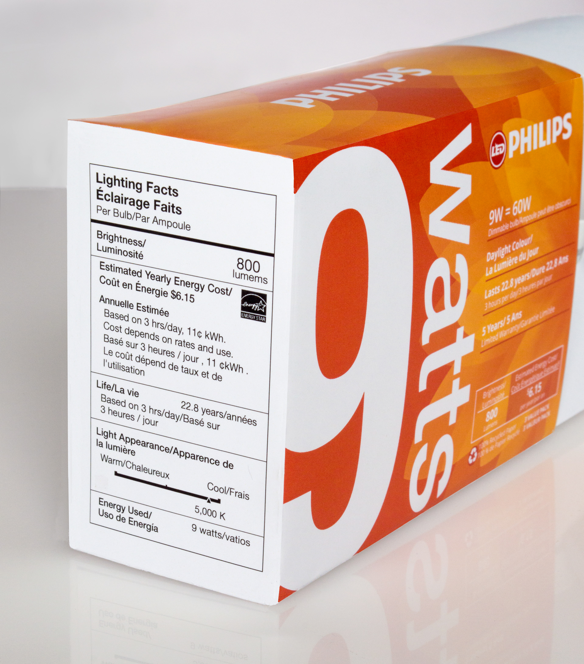
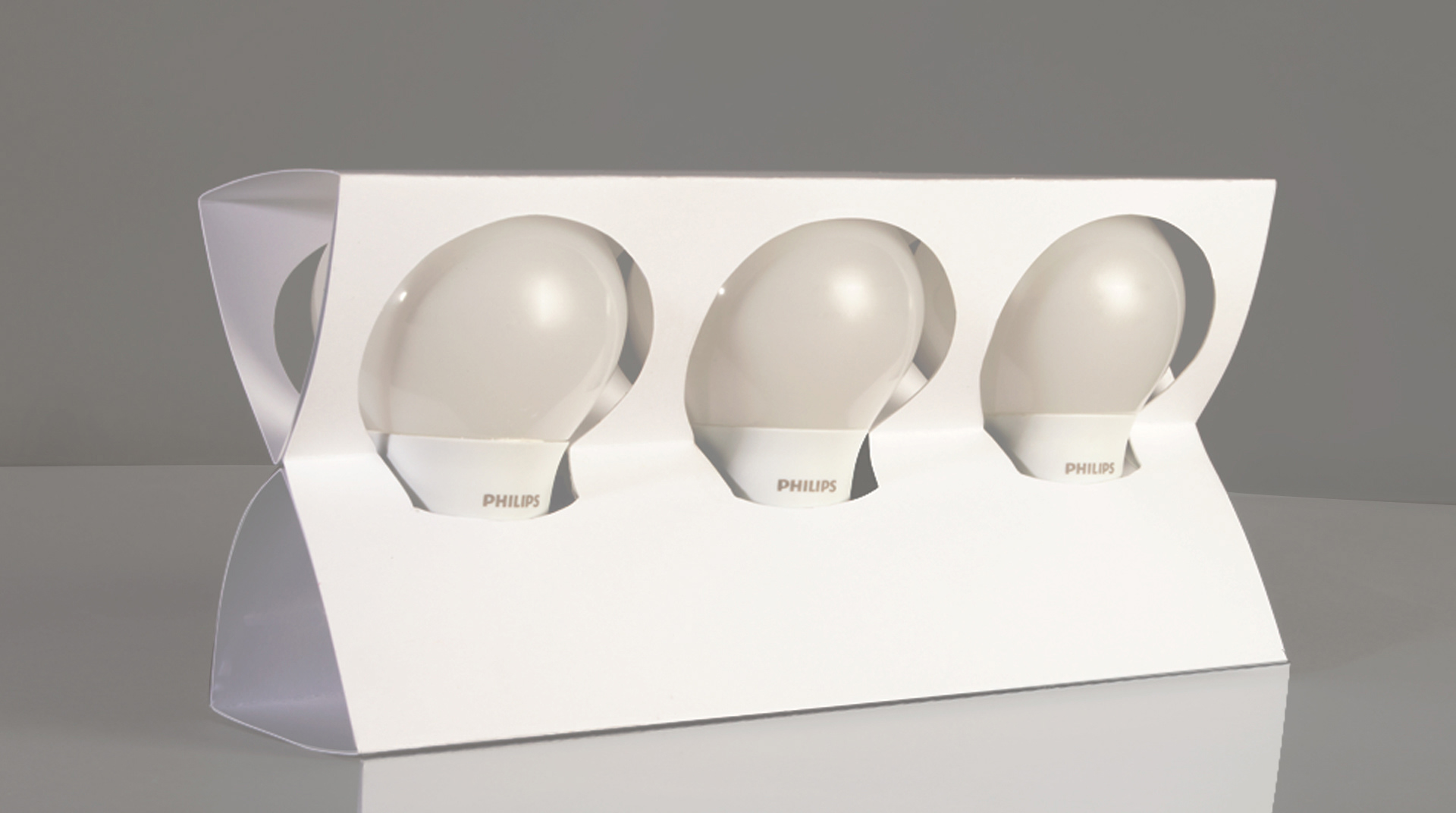
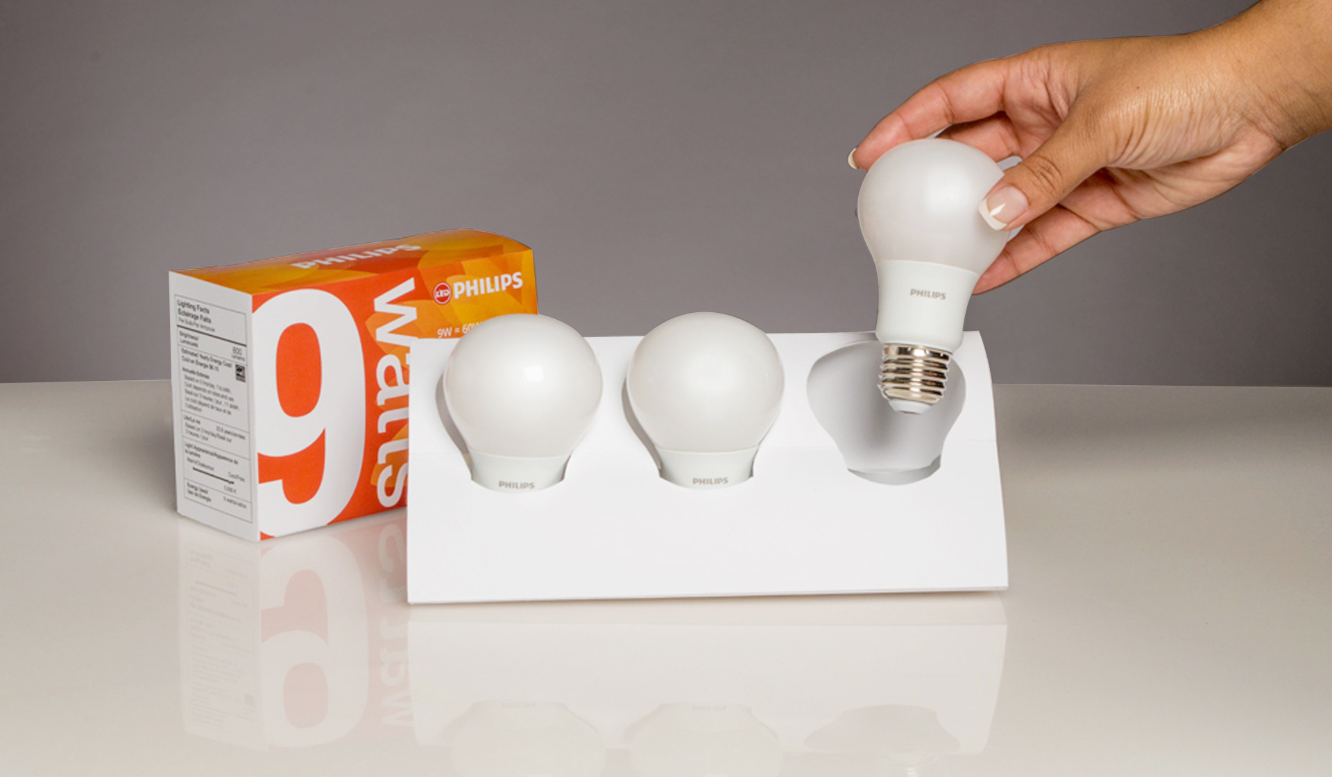


The challenge was to redesign a current product packaging that would stand out against current trends, while producing a more environmentally friendly package. The packaging was designed to update and modernize light bulb design. I used an unorthodox dieline to draw the eye, and a colour system indicating wattage to help the consumer more easily find their way to the bulb they are want. The packaging was designed to reflect a contemporary modern feel that would grab the consumer’s attention and stand out on the shelf with Philips competitors. Each wattage has its own identifiable colour, reminiscent of light being split through a prism. It also creates an easy path-finding system for consumers. This package also features standard light facts on the front and more obscure facts on the side. Familiarity is trustworthy, and these facts serve to help make new technologies easy to understand. This redesign is an eco-friendly package that eliminates all immediate plastics while combining inexpensive and organic materials.